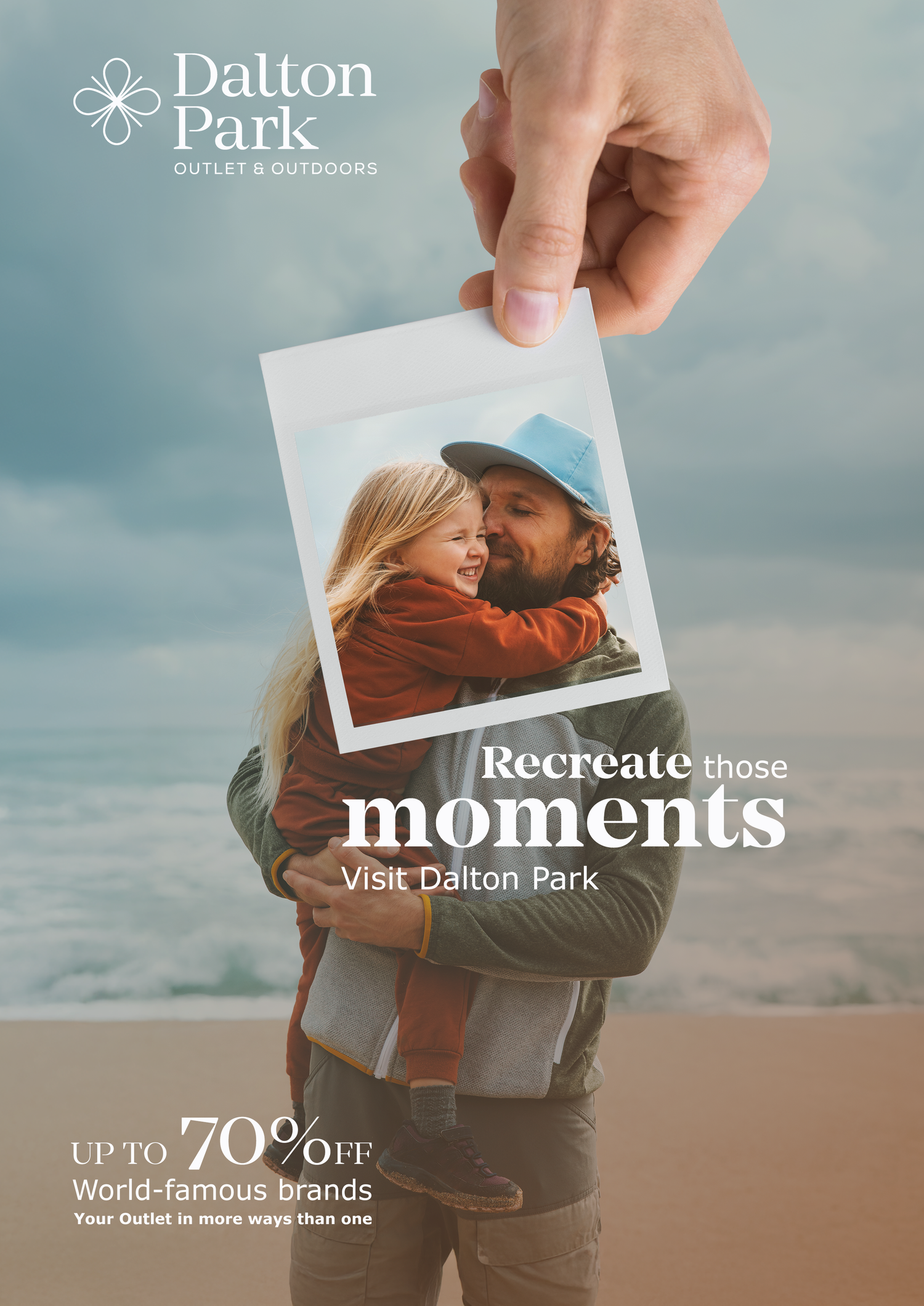
This project centred around encouraging human connection within an out-of-town shopping destination, evoking feelings of nostalgia, warmth and adventure.
The creative concept explored the idea of ‘moments’ and the possibilities they hold, creating an emotional connection between the destination and the experiences people could have there.
I was particularly pleased with the final outcome. The Polaroid-inspired aesthetic tapped into the ongoing resurgence of nostalgia in marketing, offering a sense of authenticity and human connection in an increasingly AI-driven world. It created a window into the imagination, inviting people to pause, reminisce and envision the moments they could create there – which was exactly the feeling I wanted the work to inspire.
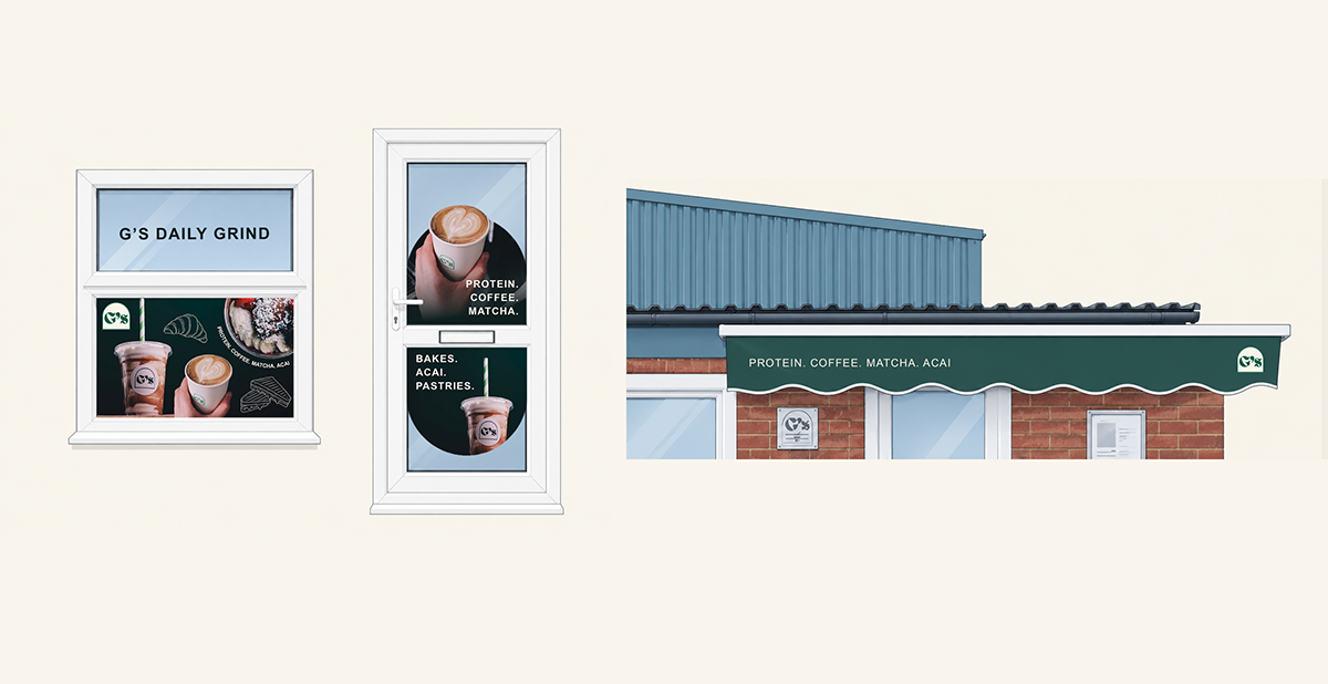
The brief was to develop a series of window, door and canopy designs for an independent local coffee shop looking to make its branding and offering more instantly recognisable.
The challenge was to communicate the food and drink offering clearly, while creating something visually engaging and design-led that would catch the attention of passers-by and leave a lasting impression.
I really enjoyed exploring the creative concepts for this project. The final direction felt clear and considered, while bringing the physical space to life. Making the most of the brand's existing photography and products, paired with playful illustrations, helped create a visual identity that felt more engaging, authentic and reflective of the coffee shop's personality.
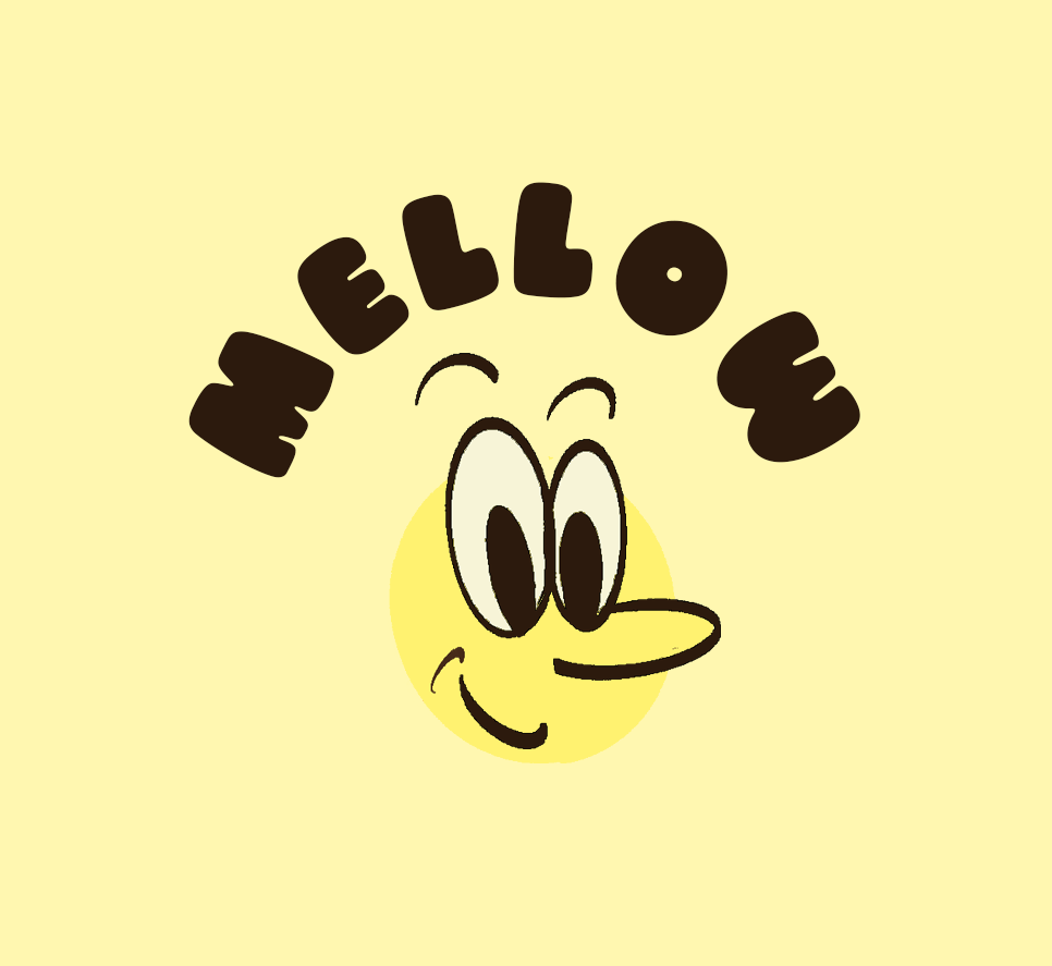
An ongoing personal branding project, with plans to expand into a range of food products in 2027.
At its heart, the brand is about capturing that feeling of being ‘mellow’ – slowing down, embracing the present and finding joy in the everyday. It has a playful edge, with an identity built around the idea of taking things a little less seriously and making more room for life's simple pleasures.
This project has become particularly meaningful to me over the past year, both creatively and in terms of the values behind it. It's something I'm excited to continue developing, so watch this space...
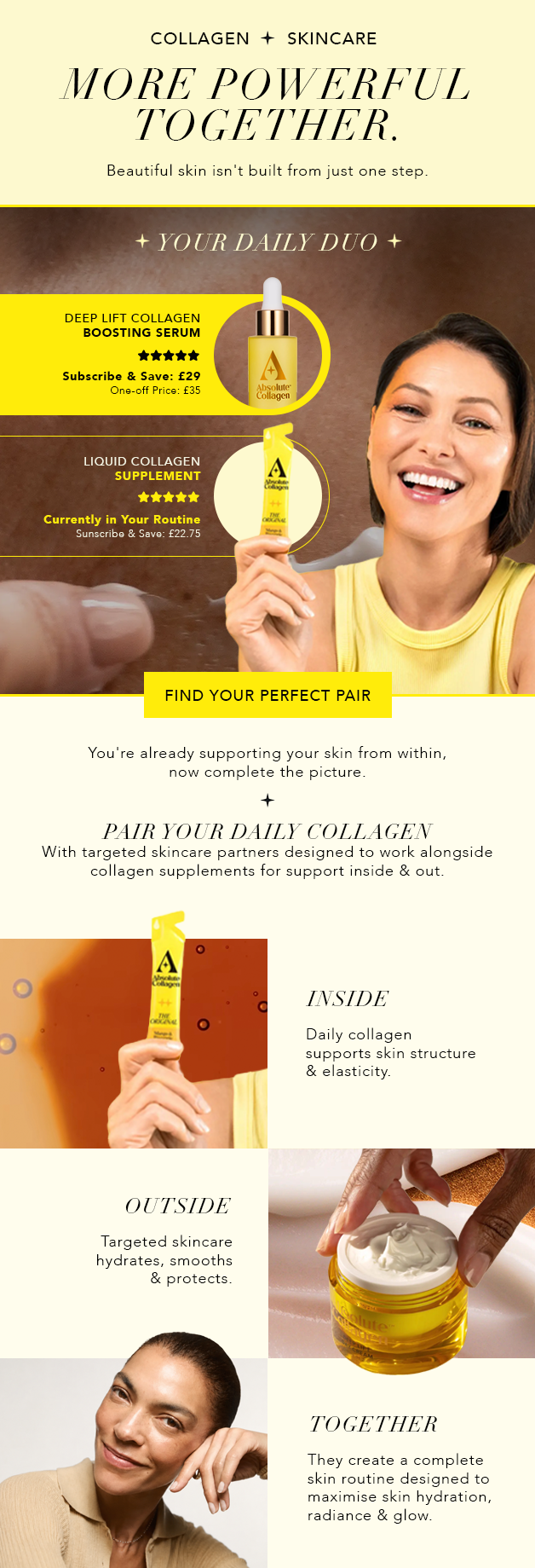
The brief was to develop a considered email campaign introducing Absolute Collagen’s topical skincare range to existing collagen subscription customers who had yet to explore the brand’s skincare offering.
Campaign objective: Increase customer lifetime value by encouraging existing collagen customers to become multi-category buyers, purchasing both supplements and topical skincare.
Core message: Better together. Absolute Collagen supports skin from within, while its topical products work from the outside, creating a complementary approach to skincare.
The creative challenge was to bring this 'more powerful together' message to life through both visual storytelling and copy, creating a compelling reason for customers to discover the wider skincare range and ultimately driving traffic to the website.
I was particularly pleased with the final outcome, as I felt the design brought the individual email components to life while remaining true to the brand's visual identity. The considered layout and creative use of imagery helped create a more engaging customer journey, encouraging exploration of the topical range without losing sight of the campaign's core message.
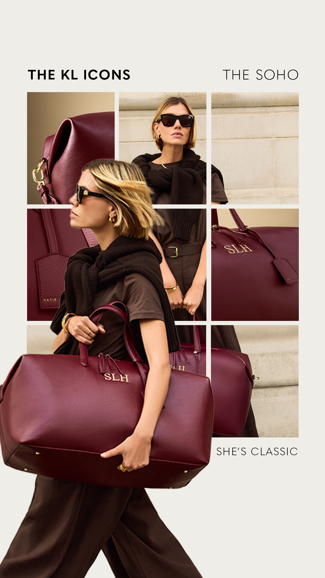
The starting point for this project was the headline, ‘The KL Icons. Iconic. Classic. Timeless. They are the moment.’ This became the creative foundation for the campaign, shaping the visual direction and tone across every execution.
The objective was to develop a series of high-impact, digital-first creatives that celebrated the new collection of statement bags, communicating both their fashion appeal and the quality behind each design. The challenge was to create a cohesive campaign identity that translated seamlessly across multiple touchpoints, including web, email, paid media, social and an in-store window concept.
I felt the final creative direction was particularly strong, striking a balance between fashion-led storytelling and the recognisable Katie Loxton brand identity. Each execution felt current, engaging and considered, while maintaining consistency across channels. I was especially pleased with the paid video and hero web banner, where the balance of product storytelling and intrigue felt just right – showcasing enough of the collection to capture attention and build desire, without revealing everything at once.